To correct a printer profile, we must first remember that we are trying to match the right sample image on the editor window to our print. The left image always shows what the image should look like. This may seem counterintuitive or backwards at first since we tend to think of making "corrections". With the Profile Prism editor, we are not making corrections directly. Instead we are telling the editor how our profiled print looks to our eyes. If your profile needs to be edited, by definition that means that it looks worse (at least in some areas) than the left image in the window. Our task is to make the right image on the editor window look worse than the "correct" image on the left in the same way the print looks worse. Once we have accomplished this task and we select "File", "Save Modified Profile As", the editor will look at what you did to the right test image on the window and will reverse the problems you have created, thereby reversing them in the profile.
The Color Tweaking Wizard
While experienced users may opt to select a color on the color wheel and manipulate the adjustment sliders on the editing window, the Color Tweaking Wizard offers more visual, real time adjustments and is easier to use because it requires less knowledge of color primaries and compliments. For example, to simulate a magenta color cast in grays, you could select the center/gray dot on the color wheel and then increase the red and blue sliders while decreasing the green slider. This requires that you know that red and blue make magenta and that green is the color compliment of magenta. To avoid the complexity of dealing with color primaries and compliments, click the "Color Tweaking Wizard" above the test images on the editor window (tool button with a dropper and stars). Next, move the wizard dropper over the left image in the editor and click on a spot that you would like to edit. The Color Tweaking Wizard will appear with a small crop of the area you have chosen displayed in the wizard. In the example where we are trying to add magenta to grays (to emulate a magenta cast in the print), we would pick an area of the image that is showing the gray cast in the print and click the dropper on that area on the [left] image in the editor. Next, we would click "Add/remove magenta" in the wizard and click the up arrow until the right image in the wizard shows the same amount of magenta as the print. Click "Apply" to exit the wizard and return to the main editor window with the changes previewed automatically. Other color errors can be removed by clicking on the wizard dropper and selecting/manipulating different areas of the image as needed until the entire image (on the right) matches the print. Remember when using the wizard that the wizard is simply a more straightforward way of manipulating the underlying adjustment sliders on the main editing window so as you make changes with the wizard, you may notice the sliders on the editor window moving according to your selections in the popup wizard window.
Manual editing
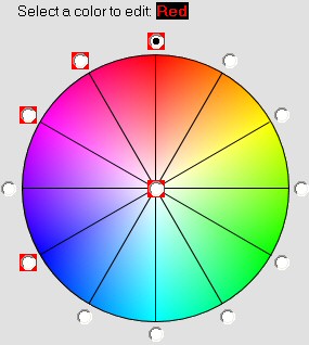
To make the right test image on the window look like our profiled print, we will be selecting an area (color) to change and then applying a change to that area. To select the area of the image that needs to be changed, we use the above color wheel. The color wheel indicates fully saturated colors at the edge. Starting at 12 o'clock on the wheel at the outer edge we have fully saturated red. At 1 o'clock we have fully saturated orange. At 2 o'clock we have fully saturated yellow, and so forth. As we approach the center of the wheel, colors are less and less saturated until we reach the center which is neutral (gray). By clicking the dot (radio button) that is closest to the area we want to change in the image, we can make different changes to different areas of the image. Notice that the dot in the center of the wheel, and the dots at 8, 10, 11, and 12 o'clock appear with a red border. These red borders indicate that changes have been made in those areas. The rest of the dots (with no red border) indicate that no changes have been made in those areas.
How to evaluate the test image/print
When comparing your print with the test image in the editor window, it is important to make your comparison and subsequent adjustments based on the "real" photographic content in the test image. In the Printer Test File.jpg test image for example, do not concentrate on the rainbow color gradient at the top of the window or the seven groups of color swatches under the words "Color Match RGB". Focus on the photographic areas of the image such as the skin tones in the face and hand, color of the blue sky, grays in the B/W dog photo, etc. The mathematical gradients and color patches are there for the purpose of being able to see how color behaves at the extremes in your profile. In general, when working with a test image that includes real photographic content mixed with mathematical color gradients or swatches, adjust for the photographic content first and then go back and examine the mathematical gradients to ensure that what you have done didn't introduce clipping, posterization, or other artifacts in those mathematical color gradients.
Example
Let's take a simple example. Suppose our print has a noticeable green color cast in the gray areas when compared to the left test image in the editor, and that red colors on our print look too undersaturated and almost "pink". Other than these two areas, the print looks great, so we just need to change these two areas.
First correct the neutral/gray cast
First, click on the center dot in the color wheel to indicate that you want to make a change in neutral grays in the image. The text above the color wheel will confirm that you have chosen to make a change to the neutral/grays in the image. Make sure that "lock both" is checked to the right of the slider controls, indicating that you want to make the same change to both the light grays and dark grays in the image. Once the center dot has been selected, increase the green bias slider a bit and then click the "Preview" button to preview that change in the right test image. You may need to click in (either) test image and drag the image around to a gray area to see your changes. You can also click the magnifying glass with a "-" button to zoom out and see the entire image. You will notice that gray areas in the right test image now have a green color cast. Is it enough? Too much? How does it compare to your print? Continue adjusting the green bias slider and then clicking "Preview" until the grays have the same green cast as your print.
Now correct the red undersaturation
Now that the grays in the right test image look green just like your print, let's correct the undersaturation of reds. Drag the test image to an area that shows reds, preferably reds that show the undersaturation problem on the print. Now click the dot at 12 o'clock on the color wheel. Just above the color wheel, the editor will confirm that you have chosen to edit "red" colors. Click and drag the "saturation" slider to the left a bit and click "Preview". Did the reds on the right test image desaturate enough to match the undersaturation in the print? If not, readjust the slider and click "Preview" until you have a match. Note that the dropper above the left test image may be used to "sample" the color in the left test image if you don't know the exact shade of the color you need to change. See the description of the dropper function at the bottom of this page for more info.
Confirm the changes
Since you have made changes to two areas (grays and reds), note that there are a lot of colors that lie in between your changes. Since you can only select a general "area" to change, values in between the selected areas are "extrapolated". For example, true red that is 100% saturated will get the change you identified at 12 o'clock on the color wheel because 100% saturated reds are right at the edge of the wheel at 12 o'clock. True red that is only 50% saturated is approaching neutral gray, however, so 50% saturated red will take on a change somewhere between your 12 o'clock adjustment and the center (neutral) adjustment. Fortunately, this scheme works quite well, but be aware that there is a bit of a "balancing act" going on here. If for example, you find that your change to reds has caused reddish orange colors to now appear undersaturated as well (because they are in between the 12 and 1 o'clock position on the wheel) an opposing adjustment may be necessary at the 1 o'clock position to counteract the "leakage" from the change to red. This is normally a simple matter of reversing the change you made at the opposing position. For example, if you decreased the saturation of red colors (12 o'clock) and now the reds look just as undersaturated as your print, you may find when you move the image around in the window that reddish orange colors now appear too undersaturated when compared to the print. If that's the case, selecting orange (1 o'clock) and increasing saturation there will usually balance the effect. After using the editor a few times, this "balancing act" will become second nature and will allow you to make specific changes to narrow areas without affecting other areas of the print.
Save the modified profile
After you have scrolled around and looked at all parts of the right test image and you have confirmed that it now looks just like your profiled print, it's time to save a new profile and try that modified profile. Click "File", "Save Modified Profile As" and you will be prompted to change the profile description (or leave it the same if you prefer). The editor will not allow you to overwrite the original profile that you are modifying, but it will allow you to overwrite any other profile if you wish.
Test the new profile
Using your new/modified profile, reprint the test image. It should look much better and be very close to the screen image. If further changes are necessary, simply reopen the profile editor and your profile and all prior adjustments will automatically be restored. For example, if you initially created a profile called test.icm and you then edited test.icm with the Profile Prism editor and saved a new/modified profile as test-modified.icm, when you reopen the editor the second time, your test.icm (original/unedited) profile will reload with all your prior changes because we always start with our original profile and simply refine the adjustments on subsequent passes. This makes further changes simple because you may only have to slide the same sliders a little more/less to compensate. We recommend always editing the original profile that was generated from Profile Prism via clicking "Edit", "Edit Profile" with each pass and simply refining the adjustments from their previous positions. Profile Prism will not prevent you from manually opening a profile that you have already edited, but this is not recommended.
If further editing is needed (second pass)
Suppose that after printing the test image again using the edited profile, the print looks much better but now your grays have a very slight magenta cast instead of the green cast that was present in the original profile, and your reds are still just a hint undersaturated. Since the gray color cast has switched to magenta, you know that you went too far with the green bias slider. Simply open the editor again and your last changes will be shown. Click on the center dot in the color wheel for neutral/grays and you'll see the green bias slider where you left it (to the right of center). Reduce the green slider by a notch or two since your original adjustment appears to have been too much. Next click the red dot at 12 o'clock on the color wheel. You'll see that the saturation slider is to the left of center because you originally told the editor that red saturation in the print was too low. Since a reprint based on your first adjustments still shows a very slight undersaturation of reds, move the saturation slider to the left another notch or two to indicate that the reds were still a little undersaturated. Click "Preview" and compare your latest (first pass) print to the right image in the editor window. Did you move the sliders enough? Too much? Does the right image look like the print you are holding in your hand, i.e. does it show the same slight magenta cast and the same hint of red undersaturation as your first pass print? If so, click "File", "Save Modified Profile As" and save this second pass profile. The process can be repeated as many times as you like to reach the final result.
Note that on your second pass through the editor, the left and right images on the editor window will be the same until you make some change to move the sliders from their "remembered" positions. The reason for this is simple. You are going to run your profiled (first pass) print through another "rinse cycle" to get the final soap out of the wash, so you are going to take the last test print you printed which is almost perfect, but not quite, and once again move the sliders from their current position to whatever new positions are required to make the right side of the preview image look like this print. On the second pass, you are essentially doing the job over again, but starting from a print that was better than the one you used for your previous set of adjustments.
A note about soft proofing
Always make a test print before editing your profiles and after editing. Soft proofing can be a useful tool for judging general gamut and some other issues, but can also be very misleading since the very reason you are editing your profiles in the first place is because your eyes see colors differently in the light you are using than your scanner did when it scanned the targets. This by definition means that there will be errors in soft proofing, and these errors tend to increase the more you edit your profiles. Suffice it to say that you need to print test images. Do not rely on soft proofing to judge profiles!
Summary of editor functions
File Menu:
- Open Profile: When you first enter the editor, the profile referenced on the main window is opened automatically. If you'd like to open a different Profile Prism printer profile, click "File", "Open" and select a profile for editing.
- Save Modified Profile As: When you have finished making changes to make the right test image look like your print, click "File", "Save Modified Profile As" to save a new profile that contains the changes necessary to correct the errors you identified in the print.
- Open Prior Adjustments From: You may find that many of your papers for the same printer require very similar adjustments. When editing a new profile (say for a new paper you just started using), you may wish to load settings that you previously used on another profile to get you started. To do this, click "File", "Open Prior Adjustments From" and select an adjustment file for a previous profile that you edited.
- Open Test Image: Although Profile Prism loads a test image by default, you may wish to open your own test image if, for example, you are having trouble printing certain colors from a certain image. Use "File", "Open Test Image" to open a different test image to be displayed in the two image windows on the upper right of the editor screen.
Color Wheel:
Use the color wheel to select colors that you wish to change.
Bias:
Change the red, green, and/or blue bias for the selected color. It may take some practice to be able to identify what bias changes are required for certain visual effects. For example, if a red rose looks too magenta in print, you'd select the red dot at 12 o'clock on the color wheel and increase the blue slider to add some blue to the rose to make it look more magenta (like the print).
Brightness:
Increase if your print is too bright for the selected color. Decrease if your print is too dark for the selected color.
Contrast:
Increase if the contrast in your print is too high for the selected color. Decrease if the contrast in your print is too low for the selected color.
Saturation:
Increase if the saturation in your print is too high for the selected color. Decrease if the saturation in your print is too low for the selected color.
Preview:
After you make any change, you must click the "Preview" button to preview the changes on the right test image at the top of the window.
Go back button:
Allows you to go back to the beginning of the current session (this session), the beginning of the last session (last session), or scratch (set all values to zero).
The "Since last preview" group and "Apply changes..." button:
The "Since last preview" group shows the changes that have been made since the last time you pressed the "Preview' button. For example, if saturation was set to -2.00 the last time you pressed the preview button and you then change saturation to -5.00, the net change is -3.00 which will be reflected in the "sat" row in the "Since last preview" group until you again press the preview button (at which point the changes reset to zero again). Note that the changes indicated represent changes for the current color/dot that is selected on the color wheel. The "Since last preview" group therefore gives us a good way to keep track of the changes we've made to the currently selected color/dot on the color wheel which have not yet been previewed in the sample image.
In the "Since last preview" group, you will see a button with an exclamation surrounded by a red circular arrow. This button will apply the listed changes for the current color/dot to all other colors/dots on the color wheel.. In the above example where we previewed -2.00 saturation and then changed saturation to -5.00, we've made a change of -3.00 to saturation. If you press the "apply changes..." button before pressing preview again, 3 "clicks" will be subtracted from the saturation slider for all colors + neutral. This is a good way to make a global relative change to all colors such as when you need to change contrast, saturation, or brightness in the entire image.
Preview: changes this pass <DEFAULT>:
Use this selection if your normal mode of editing is to make adjustments, save those adjustments to a new profile, and then make further adjustments by comparing your last test print to the right image on the editor window. This selection shows only the changes that have been made to the sliders in the current editing session in the right test image.
Preview: all (total) changes:
Use this selection if you would like to preview the total editing changes that have been made through and including the current pass. This option is useful for guaging the overall effect that your edits are having on the original profile, but is not useful for comparing against your latest test print. You might select this option if you would like to look for banding, posterization, or other artifacts that might be caused by the overall editing you have done.
Done:
Click "Done" when finished making changes. You will be prompted to save if you have made any changes.
Zoom in (magnifying glass with +):
View the test images at a 1:1 zoom.
Zoom out (magnifying glass with -):
View the entire test image at once (shrunk to fit window).
Color highlighting:
Click on a dot on the color wheel and hold the left mouse button down to highlight the colors in the test image (left side) that are closest in hue to the selected position on the wheel. When you release the mouse button, the image will reset. For example, click and hold the dot at the 12 o'clock position on the wheel to hightlight all non-neutral colors in the test image that are closest to a red hue/cast. Note that only true neutral gray colors will respond to the center dot on the wheel. If any color cast at all is present, the color will not be considered neutral even though its position on the wheel may be closest to the center (neutral gray) dot because it has very little saturation. This function is designed to help you distinguish the hue of certain color casts and will not account for saturation level (distance from the center dot on the wheel). To more accurately pinpoint which dot on the color wheel will have the most effect on a certain area in the test image, use the dropper tool below.
Dropper:
Click on the dropper above the left test image and then move over an area in the left test image. As you move the dropper over the left test image, the shade of the color under the dropper will display as a black dot on the color wheel in the upper left of the editor window. The dot will move as you move the dropper over different colors in the image so that you can sample wide areas and observe the change in color as you go. Once you've found the spot on the test image that you would like to change, click the left mouse button and that color will be highlighted on the color wheel by locking the black dot in position. Note that the radio button (selection) closest to the black dot will also be checked automatically. Also note that when the dot on the color wheel lies between several positions on the wheel, all of those positions will have an effect on the selected color to some degree. For example, if the black dot appears between the 12 and 1 o'clock positions on the wheel and halfway to the center of the wheel, the color you selected is between red, orange, and neutral (meaning that the color is a half saturated red-orange), so all three of those selections on the wheel will have an effect on the target color. Which one to change will depend on what effect you want to have on the image.